

This blog is about a workaround that one can adopt while using Combo chart. This can be useful in a scenario where the bar or the line need to be color coded based on a condition. Again, similar to the previous post Qliksense mashup – Apply filters across two or more apps , the objective here is to use the built-in chart component rather than an extension. The built-in chart component does not have this capability yet.
Please use your discretion in employing this technique as this method involves duplicating master items. Its ideal to use this technique/ trick if you have minimal requirement that you do not want to introduce an extension. If there are more measures that will be visualized in the same fashion, its better to have an extension.
For this example, I have chosen the combo chart in the default Consumer Sales app → Budget Analysis Sheet.
It looks like below. We will look at the steps to change the color of the bar based on budget revenue. If the actual amount < budget amount, green else red.

Step 1: Create two master items for the actual amount measure
Duplicate the already existing Actual Amount master item.
Step 2: Rename a measure
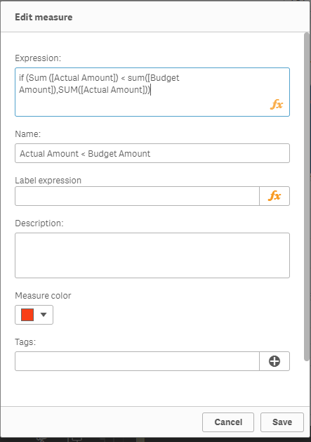
Rename one of the duplicate measures as Actual Amount < Budget and change the expression as follows using the condition. Set the color to be red
Step 3: Rename the other measure
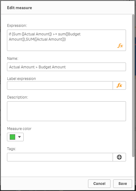
Rename the other duplicate measure as Actual Amount > Budget Amount and change the expression as follows. Set the color to green
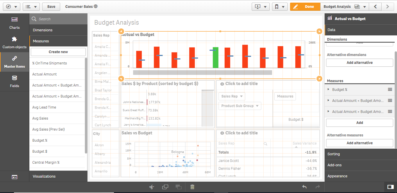
Step 4: Update chart measures
Remove the Actual Amount measure from the combo chart and add the two newly created measures. Now the chart will have either red or green bar for a given time period because of the condition we have used in the expression. However, the bars are not aligned properly.
Step 5: Align the Bars and legend
Change the bar type to stacked under the Appearance section for proper alignment. Add the legend to explain the color code.
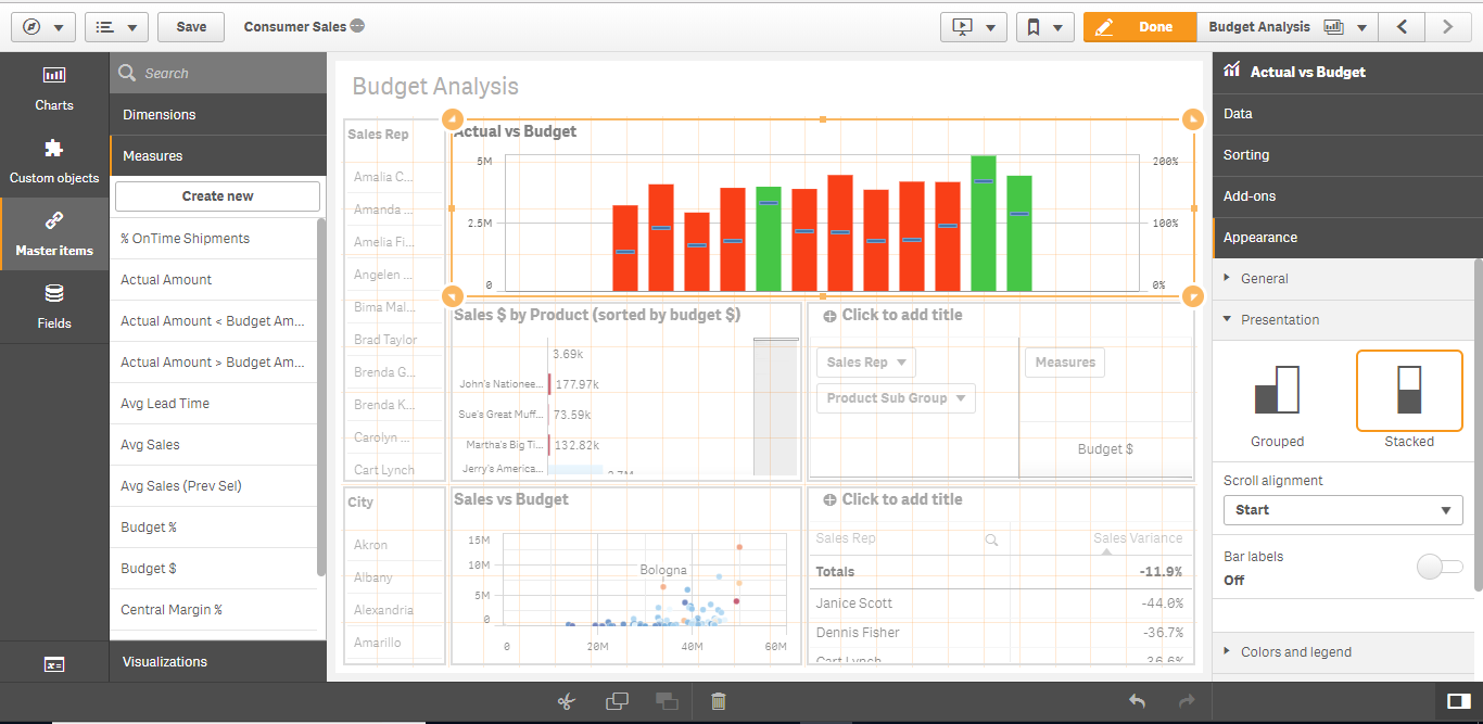
Now you can see that the chart shows green for all the revenue that is more than or equal to 100 % of budget. The blue line is the budget % measure.

Leave a Reply