

This blog explains how we can implement What If Analysis in qlik sense. What-If analysis is an important part of any analytics project. It is used to better plan for the future. It is also called as scenario planning or simulation. It is easy to create a What-If Analysis future and it does not need any work to be done in the data model. In this blog, we will see how we can implement a What-if feature that has multiple parameters.
Basis of What-if Analysis
The basis of this What-If analysis is a formula or an equation. We will have a formula written using the parameters. Then we let users change the parameters and see the outcome of the equation.
Drawing Sine, Cosine Waves and Circle
In this blog we will see how based on the parameters we set the graph changes the type of wave/ shape and its characteristics. This is an inspiration from this video to create sine wave in excel
The latest working app can be found below
Download CodeWander Qlik Sense What if Analysis
For Wave, we will be able to set the following characteristics
- Frequency
- Amplitude
- Number of Seconds to Plot
For circle, we will be able to set the following parameters
- Center
- Radius
Implement What-If Analysis in Qlik Sense
In Qlik Sense, we implement What-If Analysis using the variables and Variable Input component that is part of the Qlik Dashboard bundles that is shipped along with Qlik Sense. Variable is such a powerful feature of Qlik Sense that provides lot of application wide dynamic capabilities and alter the behavior of the application. I have already written two other Qlik Sense Tips using variables namely, Cyclic Dimensions and Standard RAG Colors.
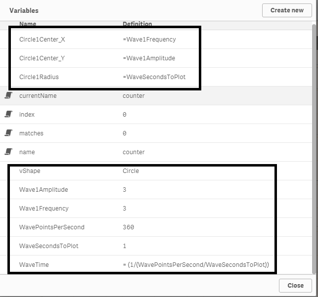
The picture below shows the list of variables we used . They are self-explanatory.
Interactions
Switch between shapes
In order to switch between shapes we use the variable input component as button group and use a variable to store the current shape.
Variable used: vShape
Change the shape parameters
We use the slider input variable components to change the parameters of the shapes. We re-use the components between the waves (Sine and Cos) and the circle. You would have noticed that in the variables image above the circle variables are mapped to the wave variables. This is to re-use the components while making the formula more readable as you will see later in the blog.
| Component | Wave | Circle |
| 1 | Frequency | Circle Center X |
| 2 | Amplitude | Circle Center Y |
| 3 | Number of Seconds | Radius |
So, based on the current shape the title and the min/ max values of the slider components change. The below image shows how we implemented it for the first component. We use the same approach for all the components.
Title
=if (vShape='Circle', 'Circle Center X','Frequency')
Min/ Max
Min

=if (vShape='Circle', -9,1)


Max

=if (vShape='Circle', 9,5)
With this we will be able to choose the shape to plot and also change the characteristics of the shape. Next we will see how to plot the shape in a graph.
Draw the shapes
We will use XY visualization to draw the shape. Before we visualize we will have to arrive at the equations for the shapes.
For the waves, the x-axis will be a time interval starting from zero. For this demonstration, i decided to choose 360 data points that i can use both for waves and the circle. I chose 360 because for circle i would use each 360 data points for the 360 degree but we can use more data points and all will be plotted in the same place for the circle. These data points are nothing but the count from 0 to 360.
Equations for Sine and Cos Waves
Following are the equations for Sine and Cos Waves
Sine wave: Amplitude * Sin ( 2 * pi * Frequency * Time Interval)
Cos wave: Amplitude * Cos (2 * pi * Frequency * Time Interval)
These equations are simpler ones that does not have phase shift and offset.
Now we have to figure out how we will increment Time Interval in the above equation so that we get a meaningful wave. The time interval has to be in such a way that we plot all the 360 points and cover the number of waves in a given time. Remember, that one of the parameters is the number of seconds to plot. So to compute the interval, we have the WaveTime variable. This variable is determined by the following formula
WaveTime = 1/ (WavePoints/Number of Seconds)
To keep it simple, following are the X and Y axis equations for the shapes and these equations are created using the variables that we defined earlier.
Sine Wave
X-Axis: Counter * WaveTime
Y-Axis: Wave1Amplitude * Sin( 2Pi() Wave1Frequency * Counter*WaveTime
Cos Wave
X-Axis: Counter * WaveTime
Y-Axis: Wave1Amplitude * Cos( 2Pi() Wave1Frequency * Counter*WaveTime
Circle:
X-Axis: Circle1Center_X + Circle1Radius*Cos(Counter)
Y-Axis: Circle1Center_X + Circle1Radius*Sin(Counter)
Now we combine all these equations and write the X axis and Y-Axis formula for the visualization. We can use either IF ELSE or PICK MATCH as shown below.
X Axis
=if (vShape =  'Circle',Circle1Center_X + Circle1Radius*Cos(Counter), Counter * WaveTime)

Y Axis
=   Pick( match(vShape, 'Sine','Cos','Circle'),
 Wave1Amplitude  * Sin( 2Pi() Wave1Frequency * Counter*WaveTime ),
   Wave1Amplitude  * Cos( 2Pi() Wave1Frequency * CounterWaveTime ),     Circle1Center_Y + Circle1RadiusSin(Counter))
Changing the Range of X and Y Axis
Earlier in this blog article, we saw that we changed the Min and Max values of the slide based on the shape. So in order to accommodate the same, we have to change the range of the X and Y axis of the chart too. It is achieved using the below formula.
Under Appearance/ Range, Choose custom and Min/Max and write the below formula
Min
=if(vShape='Circle',-10,-.1)

Max
=if (vShape='Circle',10,WaveSecondsToPlot+1)
Leave a Reply