

In my earlier post that demonstrated What if Analysis in Qlik sense, i have used Qlik sesnse’s native scatter plot to draw sine or cos wave or a circle. However, I was able to plot either one of them at a time. This got me thinking how to plot two series using the native scatter plot and hence i wrote a blog Qlik sense scatter plot multiple series that explains how using color code we can highlight two or more set of data and its limitations. Hence I thought, I will try writing an extension leveraging the opensource chart library plotly. I have another extension using ploty including animated bubble chart. Please check it out.
Download and Install
The extension can be downloaded using the link below
Download Qlik Sense Extension Scatter plot Multi Series
Extract and copy contents of the folder in the Extensions folder on your desktop or server. In Desktop, it usually is in the My Documents/Qlik/Sense/Extensions folder. you can also deploy using Qlik Management Console on the server.
Note: This extension refers to online cdn version of plotly and hence require internet connectivity.
Demo
Configuration
Measures and Dimensions
This extension requires only one dimension and an even number of measures to visualize data. The extension takes the odd measures as x-value and even measures as y-value. Each pair is a series. This design is to accommodate plotting data from different set of columns. If either your x or y value is from the same column, you can repeat the measures.
However, its important to note that the extension plots all measures using the same x and y scale/ axis. It does not support multi-axis. The extension currently supports ten measures which means you can plot utmost 5 series.
Settings
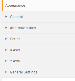
There are four sections under Appearances that helps us configure the appearance of the chart apart from the two common sections, namely General and Alternate States. They are
- Series
- X Axis
- Y Axis
- General Settings
Series
Series section lets you add details related to each of the series that you want to plot. It does not validate the number of series that you have defined in the measures section. Instead it assigns the series details in the order of appearance.
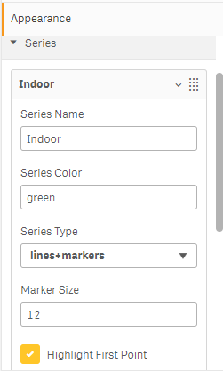
In the series section, you can enter the following for each of the series which means you can control each series independent of other series.
- name of the series
- color
- series type
- marker size
- highlight first point
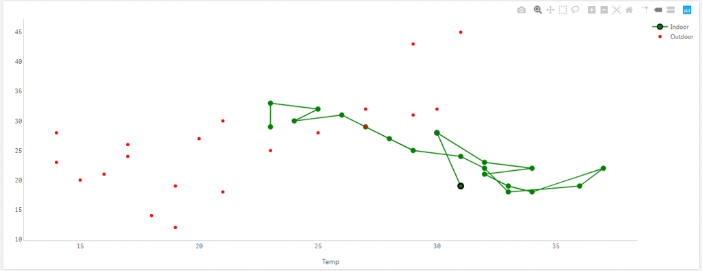
Series Type: There are three options in the series type: lines, lines+markers and markers. The markers is the usual scatter plot where as lines and lines+markers lets us draw the line to the plot connecting the data points in the order they appear in the series. The following picture shows the lines+markers and markers series in one single visualization.
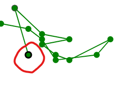
Highlight first point: This will be useful when we use the either line or lines+markers series type to identify where the series starts and helps in following the change in data points. When this option is checked, the first data point will have a black border around it as shown in the picture below.
X Axis and Y Axis
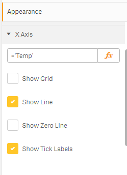
Both X-Axis and Y-Axis has the same set of parameters and are quite self-explanatory. This option lets you choose configure how the grid-lines, zero line, axis base line or the labels need to be plotted.
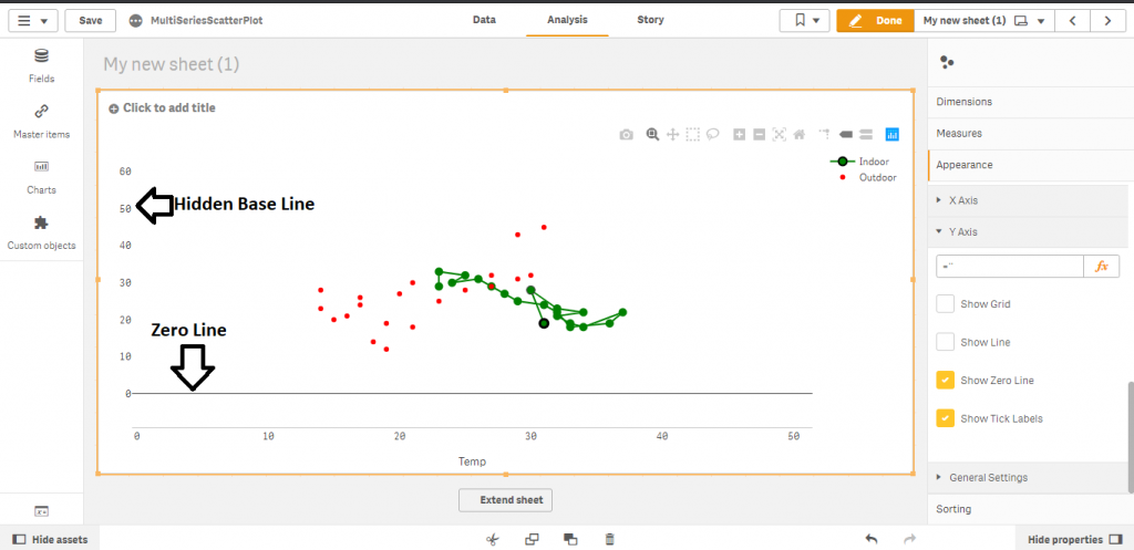
Show Line vs Show Zero Line
The Show Line is to show or hide the base line of the axis whereas Show Zero Line is to show or hide the line at the point zero. In the picture below, we can see that for the Y-Axis, we hide the axis line but show the zero line
General Settings
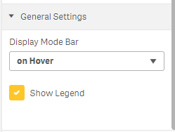
General Setting has two options. They are
- Display options for mode bar
- Show Legend
The mode bar is the list of buttons that appear on top. You can choose to have it or hide it using this option. Currently legends are shown on the right side vertically. I will add more options for the same eventually. Currently you can either show or hide the legend.
I am wandering if data from different series can be interconnected somehow and how can we do that?
For example i want to analyze sales versus budget by country or region or agent, but interconnected somehow ( in this moment i can see this data only by making specifically selections on single dimension value)