

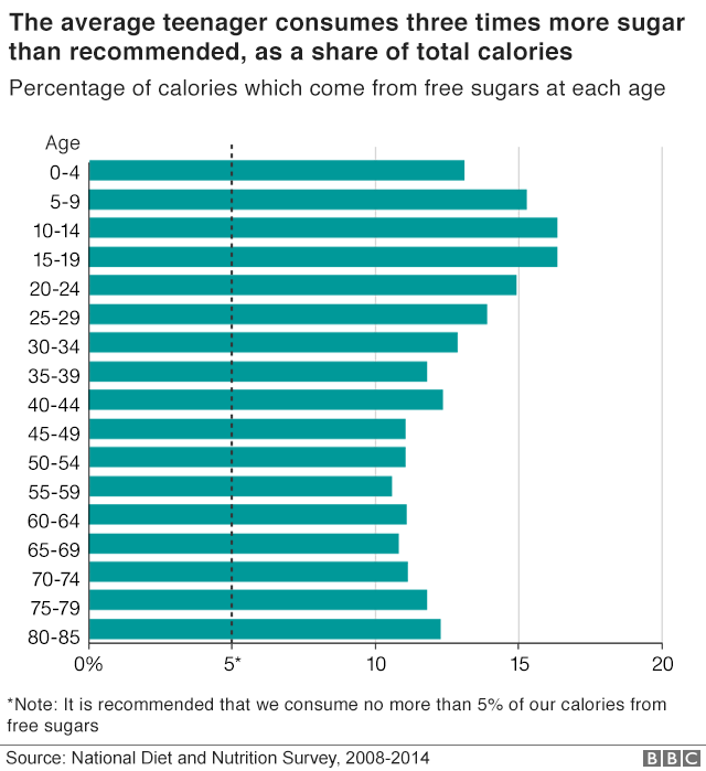
This blog is my analysis and thought process on how I arrived at the Makeover Monday visualization on week three of year 2020. The visualization is about the excess sugar consumption that was published in BBC. The chart we will makeover this week is below.
Objective of Makeover Monday 2020 Week 3
- What works and what doesn’t work with this chart?
- How can you make it better?
Analysis
My analysis is not about how much more information we could extract out of the data set but how much information is need to support or supplement the article.
What works with this chart?
The article talks about sugar consumption against the recommended amount. The chart does a good job in highlighting the recommended range and it quickly lets the reader know how much the sugar consumption is above the recommended range for different age groups.
What does not work with this chart?
In the chart there are three age groups that consume three times more sugar that the author mentions in the article. It takes some time to figure out the age groups that the author is referring to in the article.
How can we make it better?
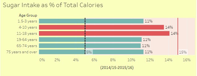
Highlight the group/ category (children) in the chart
The chart presents the sugar consumed as percentage of total calories by age groups. The article explains that the kids consume three times more sugar than the recommended 5% of total calories. However the visualization does not highlight the age groups that are in discussion.
We can highlight the age group that the article focuses so that the readers can easily grasp the age groups.
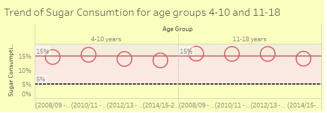
Show the trend of Children Category
The article also states that the overall goal is to reduce child obesity
Why? There is a recognition that bold moves are needed if the ambition to halve the child obesity rate by 2030 is to be achieved.
Source: Is it time to treat sugar like smoking?
So the article is about reducing child obesity though the dataset contains trend for adults as well. In order to stay relevant to the article content and to support the argument, I will add the trend for the children that will be highlighted in the first chart.
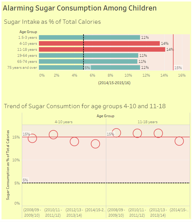
Makeover Monday 2020 Week 3 – Final Output
So with these two charts we will have data that supports and supplements the content of the article and the emphasizes author’s point of view. The makeover is done using Tableau. The final output is as seen below.
You can also see the live dashboard in Tableau Pubic .
Please share your feedback on the same.
Leave a Reply