

This post is part of the Odoo Dashboard in Qlik Sense and Power BI series. It is an attempt to create a simple Odoo dashboard in Qlik Sense and Power BI using Talend as an ETL tool. In this post I will compare the self-service dashboard creation: Power BI vs Qlik Sense in three aspects from an end user standpoint
- Data Loading with no scripting
- Creating new/ derived measure/ field
- Format the measure/ field
Power BI vs Qlik Sense
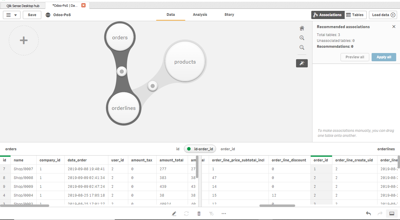
Data Loading
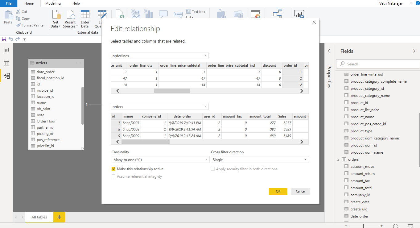
Data Loading has been easy in Qlik and Power BI. But for an end user who has not been using data modeling or data loading tools, Qlik’s Data Manager may be more intuitive and easy to use as it eliminates many of the complications and keeps it simple. In Power BI, there are few terminologies that may not be easy for end users to comprehend. The learning curve for non-IT users may be faster with Qlik Sense than Power BI.
Creating derived measures to use in visualization
This is regarding a dynamic measure creation in the visualization layer rather than during transformation. There are various ways to create this in Qlik and Power BI.
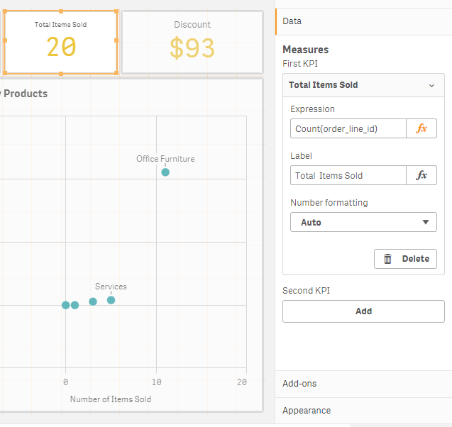
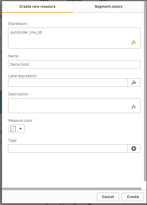
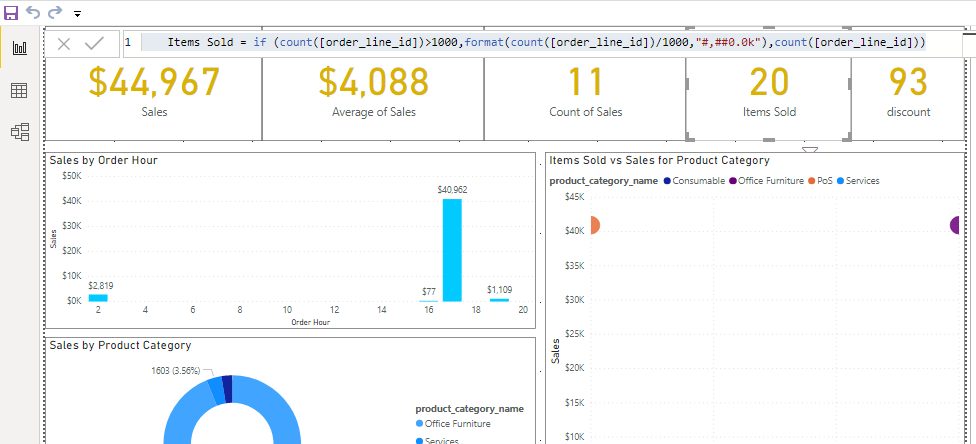
In this dashboard, we need to create a simple measure: Items Sold
In PowerBI, this can be done using “Create Measure” and add the formula as below in the images. Irrespective of when you add a measure ,it gets stored in the model for you to manage it centrally and reuse. You can also format the newly created measure. I will touch upon the format feature later in the article.
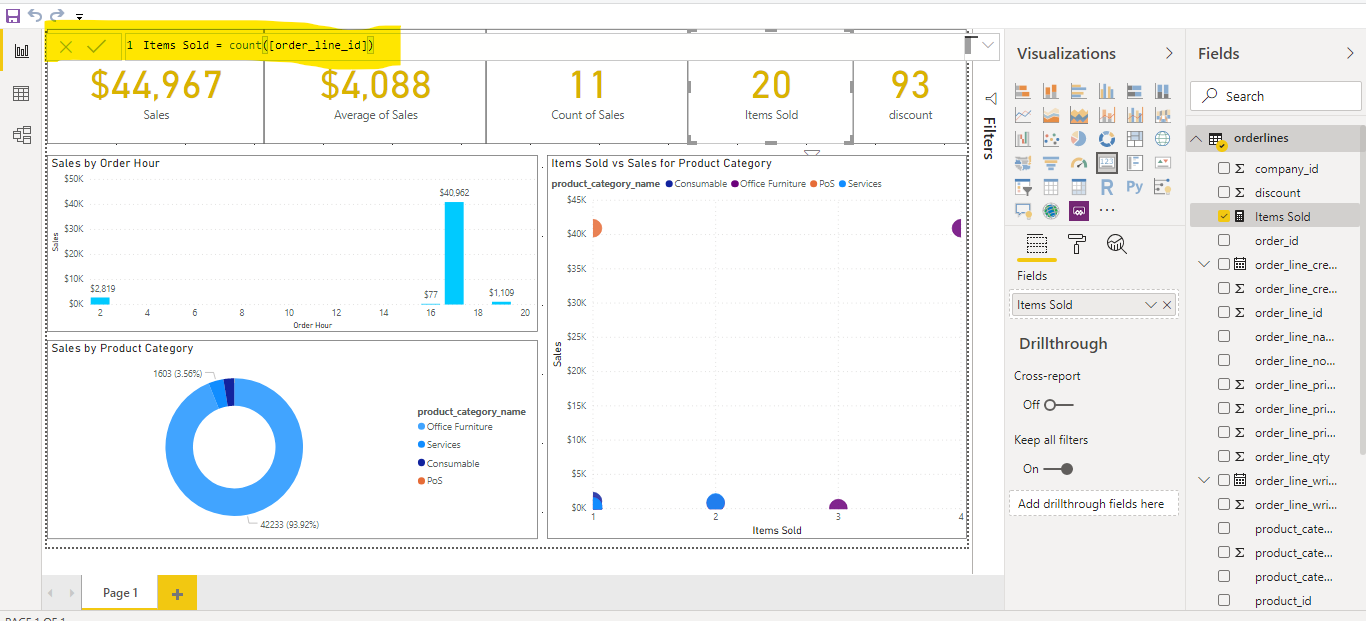
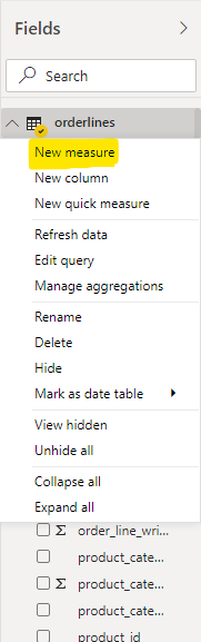
In Qlik, you can create measure in two ways. First, you can create the measure directly in the visualization object. Second, you can create a master measure and then reuse it in any of the visualization object.
While there is no right way of creating a derived measure, i feel that Power BI enforces the user to centrally manage the derived measure and reuse it else where. However, in Qlik, there is a chance that you may end up creating different measures for each chart and it could become difficult to manage in case of large dashboards with lots of sheets, visualizations and measures.
Format Measures and Fields
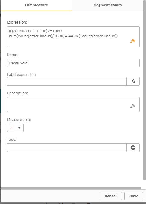
Formatting a measure (display unit, thousand separator) is critical part of any dashboard. Both Qlik and PowerBI address this effectively. However, there is a stark difference in the approach. Qlik typically addresses the formatting in the visualization object though you can embed format as part of the (master) measure expression as well. This gives lot more freedom for the users to change the format depending on conditions dynamically in the same visualization or adopt different format in different visualizations. For example, as shown in image below, i can represent items sold as actual numbers as long as it is less than 1000 and suffix it by K when it reaches above 1000. In this case format is done using qlik expressions rather than the measure’s format feature.
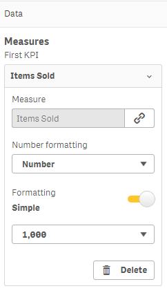
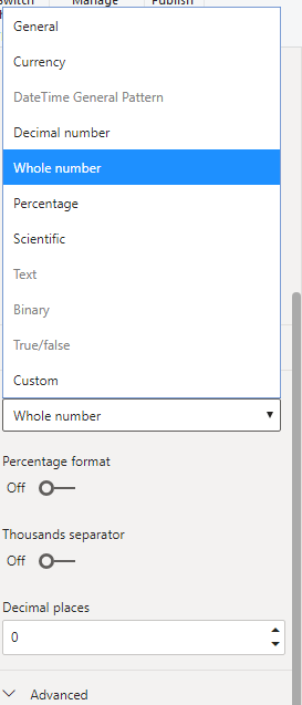
In Power BI, by default formatting is addressed in the data/ model layer. Even for the new derived measure that you create, you have to set the format in the model/ layer. You can change the display units and decimal places in the visualization object. This kind of restricts the freedom for the end users in some exception cases. However, you can always use DAX (Data Analysis eXpression) to format the values in the presentation layer. You can achieve the conditional format for Items Sold in Power BI also. In my opinion, for the most cases having format at one place makes it easier for the developer or analyst community to set it once and use it everywhere. However, there must be a freedom to change it at visualization object level without using the expressions.
Wrapping up Part 1: Power BI vs Qlik Sense
From my experience, its almost a similar experience to create a simple dashboard and format the measures, though I personally feel that Qlik sense’s user interface is clean and minimal for an end user to create a dashboard especially the data loading part. But with some constant training either of the tools can serve the need for quick self-service dashboard.
In this series, I will further write on other aspects of dashboard creation as well
Leave a Reply